Picking the perfect white paint color for kitchen cabinets
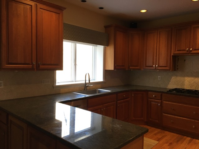
Hi there! I am very excited to blog today about picking the perfect white paint color for kitchen cabinets. If you have been reading the blog recently you know that we are updating our nineties kitchen (on a budget!). The first step has been painting the orange-toned, cherry cabinets white. We decided to make this the first step as our hunch was that may be enough to seriously lighten and brighten as well as update the kitchen (versus a complete redo). In our case, we cook a lot (this blog was started to share recipes…) and the layout is perfect. The looks not so much – classic nineties kitchen with the orange tones and sage green counters. We had a feeling that a fresh, white coat of paint may do just the trick.
I have been eager to share this with you (spoiler alert I love the new white cabinets) but have been swamped at work and as I mentioned in my last post, you have to empty your cabinets (or you should), and even when you empty the cabinets dust still seems to get everywhere! Not for the faint of heart my friends…and especially not for a busy working mom with little time on her hands as it is! But, with that behind me, I can say it has all been worth it. So without further ado, today’s post is how to pick the perfect white paint color for your kitchen cabinets – I am sharing my favorite resources as well as the steps I took.
Steps to pick the perfect paint color
Ok, so like any other home improvement project mine always start with reading my favorite blogs, magazines and checking out Instagram and Pinterest. This is easy but I will say beware when it comes to paint colors. Just because a color (and especially white) looks good in a blogger’s home does NOT mean it will work in yours. So doing some browsing is great as a start but the devil is in the details. Do not just take what they have used and go buy the paint and put it on your walls!
After getting an idea of what family of color I want to focus in on, I head to the paint store. We are fans of Benjamin Moore so I usually stick with their palettes although I have found some great colors in Behr and the other brands. Pick out as many chips as you like at this point. The chips will help you narrow down your choices. Again, if I can leave you with two caveats. The above warning about blogger/decorator recommendations, and a second – do NOT pick your paint and actually paint your walls based on a tiny paint chip. Years ago I had chosen what I thought was a blue grey, and it ended up being light teal on the walls (fortunately I like teal!).
Which resources offer great advice on picking the perfect paint color for kitchen cabinets?
After several mishaps of trying to paint a room using a tiny paint chip as a way to visualize, I realized I needed to take one crucial step – painting the wall at least partly or by using a fantastic peel and stick paint sample in a large size to see what the color actually looks like on OUR wall (not some blogger or decorator’s home).
So at this point, I usually narrow down my paint chips to two or three and then I either go buy a sample of paint, or I order the color from Samplize which I absolutely adore. Samplize paints two coats of the color on a large, peel and stick wallpaper square. You can move the sample around to see it in different lights and locations. Folks this was a game changer! It is really worth the cost (around $6), and actually less expensive than buying a paint sample (not to mention messy and time consuming to paint it on your walls and have to look at an eye sore for days until you actually paint #beentheredonethat).
In addition to ordering colors I think would work in our home, I also have two blogs that I highly recommend you check out for their advice on picking a paint color. The first is my absolute favorite with paint expert, Kylie offering a great advice with a good dose of humor (dang that gal loves her wine:). You can really get technical here and learn about the LRV of a paint color (light reflecting value) and where to find it for each color. She also has so many before and afters, and what I love is that she works with people on a budget. I do not personally find it all that helpful to read about people with million dollar design budgets redoing their homes (hello…wouldn’t we all have a perfect home with that budget? And, what fun is that!?). Kylie also offers really great review of all colors and especially whites. White Dove? She has you covered? Simply White? That one too. She is a fantastic, free resource that helped me so much. Folks, you need to learn the difference between your cool whites and your warm whites if you are going to pick the perfect white paint color for your kitchen cabinets.
The second blog that I recommend is Maria Killam. She also has some excellent advice about paint colors in general as well as many photos that can help inform your decision. She explains how to understand a color’s undertones (goodness when did this all get so complicated?). Between Kylie and Maria, there is a ton of great advice and frankly I would have picked the wrong white paint color for kitchen cabinets without their wisdom. Thank you ladies if you ever read this!
How did I ultimately pick the perfect white paint color for our kitchen cabinets
So after setting up Pinterest boards, searching #whitekitchen on Instagram, reading blogs and finding the wonderful advice from Kylie and Maria, I took those paint samples from Samplize and pasted them on the wall. I looked at those dang samples in the morning, at night and at all hours of the day. I moved them around, held them up to my backsplash and asked everyone’s opinion (well maybe not everyone but my one daughter who is very into design).
We looked at White Dove (too yellow), Simply White (also yellow), Decorator’s White (icky sterile, hospital white in our lighting) and dozens more. Finally we decided on Benjamin Moore’s Swiss Coffee. It has no yellow undertones (again in our light) but was so much softer than the other whites under consideration. It also seemed to pair beautifully with another Moore color, Sail Cloth, which we decided to use for the walls. This entire process took about three weeks. If you don’t have that much time, you could possibly compress it…but I say, don’t rush it. Painting your kitchen cabinets is a big change so you want to get it right!
Next post – I will reveal the “after” photos. I am waiting for a new hood and we need to repair one part of the backsplash before I can share the photos with you. Until then, do your research before trying to pick the right white for your kitchen cabinets! Mimi